Does Your Team Argue About Numbers in Every Meeting?
You are not alone. And it is not a people problem. It is a data problem.
A Story That Might Sound Familiar
A global digital learning platform. Millions of users. Thousands of courses. Subscriptions and payments flowing in every single day.
From the outside, everything looked like it was working.
Inside, it was a different story.
The finance team had one revenue number. Sales had another. Product had a third. Every Monday morning meeting turned into a debate about whose spreadsheet was right instead of what the business should actually do next.
And the worst part? Nobody was wrong. They were all just pulling from different systems that had never been connected.
Sound familiar?
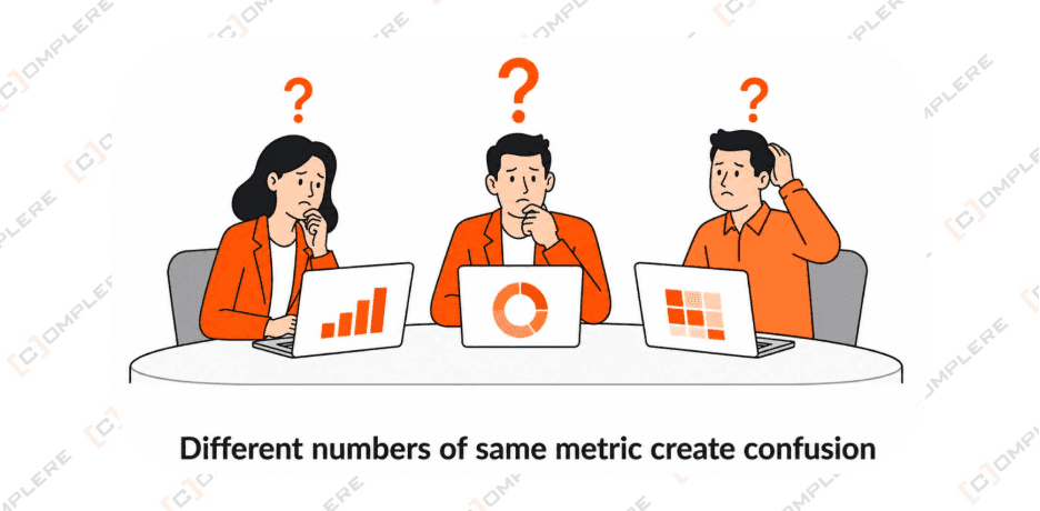
The Monday Morning Problem A meeting room scene. Three people each holding a different number on their laptop screens for the same metric. Confused expressions. A question mark in the center of the table. AI Image Prompt: "Flat design illustration of a business meeting room with three people sitting around a table. Each person has a laptop showing a different revenue number. Confused expressions on their faces. A large question mark floating above the center of the table. Clean minimal style, blue and orange palette, white background."
The Problems We Found
When our client came to us, they had four problems sitting on top of each other.
Data living in too many places
Customer information was in the CRM. Billing was in a separate platform. Payments were somewhere else. Content usage was in another system entirely.
Four systems. Four different pictures of the same customer. Zero way to see all of it at once.
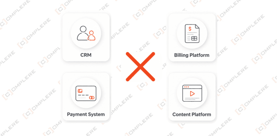
Four Systems, Zero Connection Four icons arranged in a square with no lines connecting them. CRM, Billing, Payments, Content Platform. A big red cross in the center. AI Image Prompt: "Flat design graphic showing four software icons arranged in a square formation with no connecting lines between them. Icons labeled CRM, Billing Platform, Payment System, Content Platform. A large red X in the center. Clean white background, muted colors, simple modern style."
Teams could not agree on the same number
When every system calculates metrics differently, you do not have a data problem. You have a trust problem.
Nobody trusted the reports. So nobody acted on them confidently. Decisions got delayed. Opportunities got missed. The senior team spent more time questioning the data than using it.
Customer data was sitting in the wrong places
Privacy regulations require businesses to delete or mask customer data when requested. This company had no defined process for that.
Test environments had real customer names, emails, and payment details sitting in them. Every developer working on a new feature could see real customer information.
That is not just a compliance risk. That is a lawsuit waiting to happen.
Reports were always a day behind
Their pipeline ran overnight. Every morning the team opened reports showing what happened yesterday.
For a subscription platform where a cancellation spike needs to be caught and acted on immediately, yesterday is too late.
Why Most Teams Stay Stuck
Here is what most companies do when they hit this point.
They buy a new tool. They hire more analysts. They run another dashboard project.
And six months later they are back in the same Monday morning meeting arguing about the same numbers.
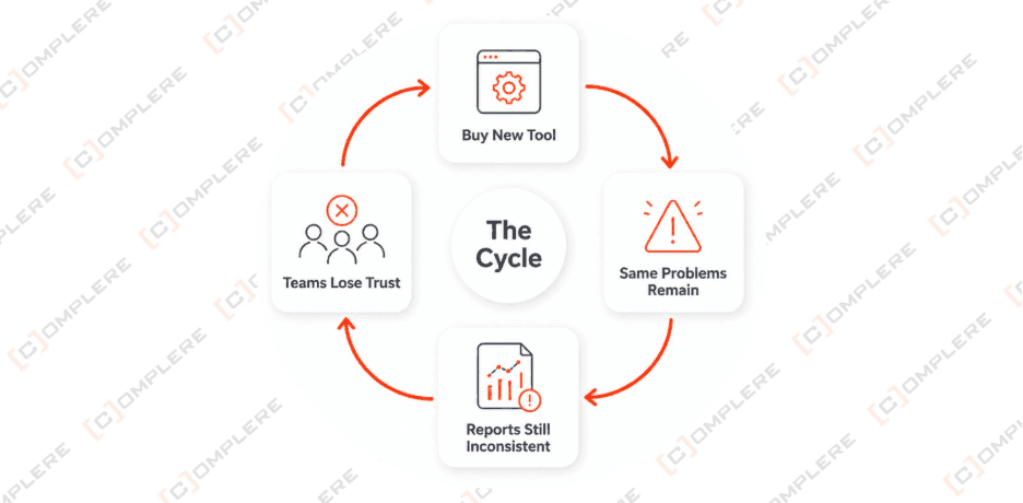
The Cycle Most Companies Get Stuck In A circular loop diagram. Buy New Tool > Same Problems Remain > Reports Still Inconsistent > Teams Lose Trust > Buy New Tool again. Red color scheme. Label in the center: The Cycle. AI Image Prompt: "Circular loop infographic showing a recurring failure cycle. Four stages in the loop: Buy New Tool, Same Problems Remain, Reports Still Inconsistent, Teams Lose Trust. Arrow connecting each stage in a circle. Red color accents. Center label The Cycle. White background, flat design, warning style graphic."
We did something different.
Before we wrote a single line of code we spent time understanding the data itself. Where it came from. What it meant. Why the same word meant different things in different systems.
Then we built the foundation that should have been there from the start.
What We Did
We built one shared data model everyone works from
We documented every data source. We defined every metric once. We built a shared model that all 12 business areas could use so that revenue means the same thing to finance, sales, and product for the first time.
This is the unglamorous part of data work. It is also the part that makes everything else work.
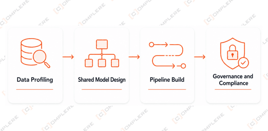
How We Approached It Horizontal four step timeline.
Step 1 Data Profiling: Understand what data exists and where.
Step 2 Shared Model Design: Define every metric once for every team.
Step 3 Pipeline Build: Build pipelines that move data cleanly.
Step 4 Governance and Compliance: Lock in privacy, masking, and access rules.
AI Image Prompt: "Horizontal process timeline with four numbered steps connected by arrows. Step 1 Data Profiling, Step 2 Shared Model Design, Step 3 Pipeline Build, Step 4 Governance and Compliance. Each step has a short description below it. Flat design, blue and white, clean white background, professional style."
We built a pipeline that grows without breaking
We built a clean flow from data source to final report. Every piece of data moves through the same stages in the same way.
Raw Data In > Cleaned and Unified > Ready for Every Team
And we built it so that adding a new data source does not require rebuilding the whole thing. The team plugs it in and it works.
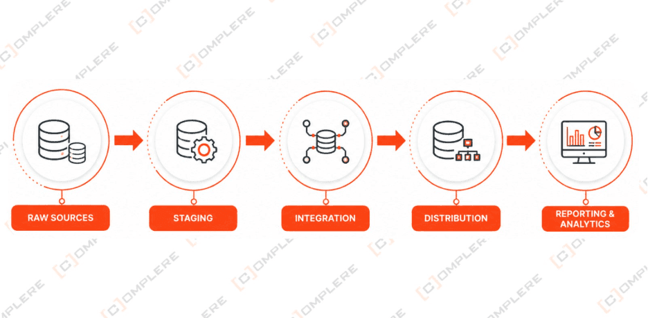
How the Data Flows Now Left to right pipeline diagram. Raw Sources > Staging > Integration > Distribution > Reporting and Analytics. Clean boxes with arrows between each stage. AI Image Prompt: "Clean horizontal data flow diagram with five stages. Boxes labeled Raw Sources, Staging, Integration, Distribution, Reporting. Right pointing arrows between each box. Small icons representing databases and dashboards inside boxes. White background, blue gradient boxes, flat design, minimal text."
We replaced overnight reports with live data
We moved all historical data to a modern cloud warehouse. Then we set up live streaming so data flows in continuously throughout the day.
The team no longer opens a report to see what happened. They open a report to see what is happening.
That is a different way to run a business.
We made compliance part of the build, not an extra step
We defined a clear process for data deletion requests. We set up test environments with proper masking so developers never touch real customer data. We built reusable templates so the same compliance steps apply automatically to every new project.
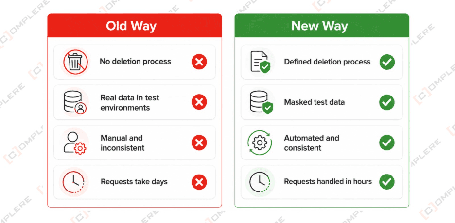
Old Way vs New Way Two column comparison. Left column Old Way with red cross marks: No deletion process, Real data in test environments, Manual and inconsistent, Requests take days. Right column New Way with green tick marks: Defined deletion process, Masked test data, Automated and consistent, Requests handled in hours. AI Image Prompt: "Two column comparison infographic. Left column titled Old Way with red X marks: no deletion process, real data in tests, manual, inconsistent, days to respond. Right column titled New Way with green checkmarks: defined process, masked test data, automated, consistent, hours to respond. White background, flat design, clean professional style."
What Changed After We Finished
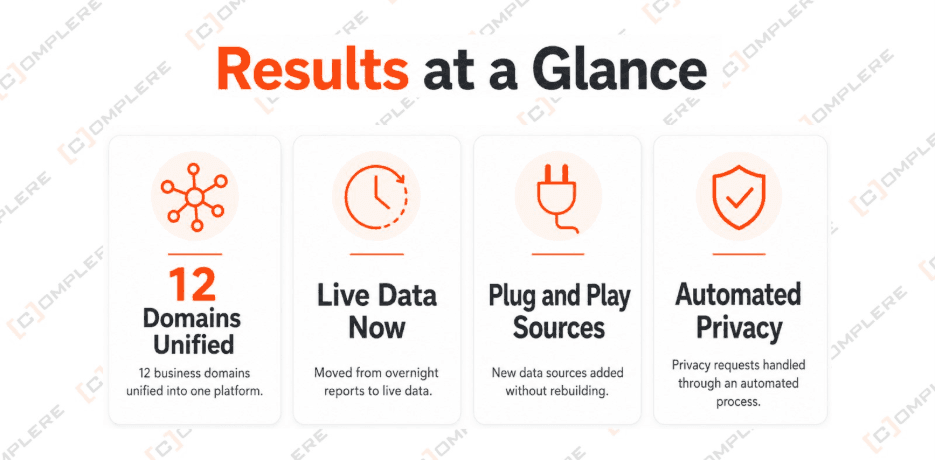
Results at a Glance Four bold stat cards in a row. Card 1: 12 Business Domains unified into one platform. Card 2: From overnight reports to live data. Card 3: New data sources added without rebuilding. Card 4: Privacy requests handled through an automated process. AI Image Prompt: "Four large metric highlight cards on white background arranged in a row. Card 1 network icon text 12 Domains Unified. Card 2 clock icon text Live Data Now. Card 3 plug icon text Plug and Play Sources. Card 4 shield icon text Automated Privacy. Bold modern typography, blue and orange color palette, flat design."
The Monday morning meeting changed.
Instead of spending the first 20 minutes arguing about which number was right, the team opened one dashboard and moved straight to decisions.
That is not a small thing. That is hours of leadership time back every single week.
Real time data meant the team could catch a cancellation spike within hours instead of finding out the next morning when it was already too late to respond.
Compliance stopped being a background worry. Requests are handled. Environments are clean. The risk is gone.
And when the business needed to add a new data source three months later, it took days instead of weeks. The architecture was ready for it.
What We Learned From This Project
We will not pretend it was easy.
Twelve business domains had been running independently for years. Nobody had a complete picture of how inconsistent the data had become. Untangling that and building something solid in its place takes real time and real focus.
But here is what we know from doing this work.
The businesses that skip the foundation always come back to fix it later. Usually at a much higher cost. Usually when the problem has grown into something affecting revenue, compliance, or customer trust in a visible way.
The businesses that do it properly the first time grow faster. They make better decisions. They spend less time arguing and more time moving.
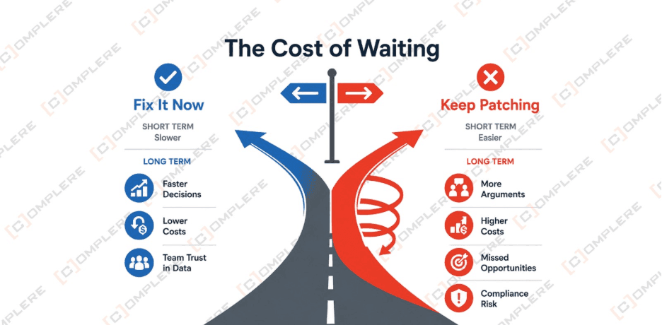
The Cost of Waiting Two path diagram. A fork in the road. Left path: Fix It Now. Short term slower. Long term faster decisions, lower costs, team trust in data. Right path: Keep Patching. Short term easier. Long term more arguments, higher costs, missed opportunities, compliance risk. AI Image Prompt: "Fork in the road infographic showing two paths. Left path labeled Fix It Now showing upward growth arrow with labels faster decisions, lower costs, team trust. Right path labeled Keep Patching showing downward spiral with labels more arguments, higher costs, compliance risk. Clean flat design, blue for left path, red for right path, white background."
Is This Your Situation Right Now?
If you are reading this and recognising your own Monday morning meeting in these words, that is not a coincidence.
This problem is more common than most data teams want to admit.
The good news is it is completely solvable. We have done it across healthcare, fintech, SaaS, and media companies. We know exactly where the complexity hides and how to untangle it without disrupting the business while we work.
If any of these sound like you right now:
Your teams pull from different systems and get different answers
Your reports are always a day behind what you actually need
You have privacy and compliance gaps you know exist but have not properly fixed
You are adding new data sources and it is getting harder to manage every time
Then this is exactly the kind of project we do.
Let Us Talk
You do not need to figure this out alone.
Book a free 30 minute call with our team. We will listen to where things stand, show you how we would approach your specific situation, and tell you honestly whether we are the right fit.
No pitch. No pressure. Just a straight conversation. BOOK YOUR FREE CALL
Or send us a message and we will get back to you within one business day.
About Complere
Complere is a data engineering and analytics firm working with healthcare, fintech, SaaS, and media companies across the US, UK, and Asia.
We help businesses build data foundations that actually hold so that every team can make decisions from one trusted source.
12 countries. 80 plus specialists. One focus: making your data work for your business.